A 6x6 Dimensional Card using Lemoncraft's House of Roses Paper
for Cherish the Memory
Hey there! Welcome to my blog post!
I love red and pink. I love both of them together, but out of the two if I had to choose one I would most certainly pick pink! A super bright fuchsia pink! I try to work in colors other than pink because it is one of the many ways I challenge myself as an artist. So, when I was sent this paper collection by Lemoncraft called House of Roses from Cherish the Memory, this girly girl was delighted! As usual I will post links at the end of my post on where to purchase.

So I went with simple design again with this card. Much like the last card, I wanted to keep it a neat and fast to make project. Coming up with the layout took me less than ten minutes and about half an hour to assemble! Oh! And while watching my soap opera! Talk about multitasking!

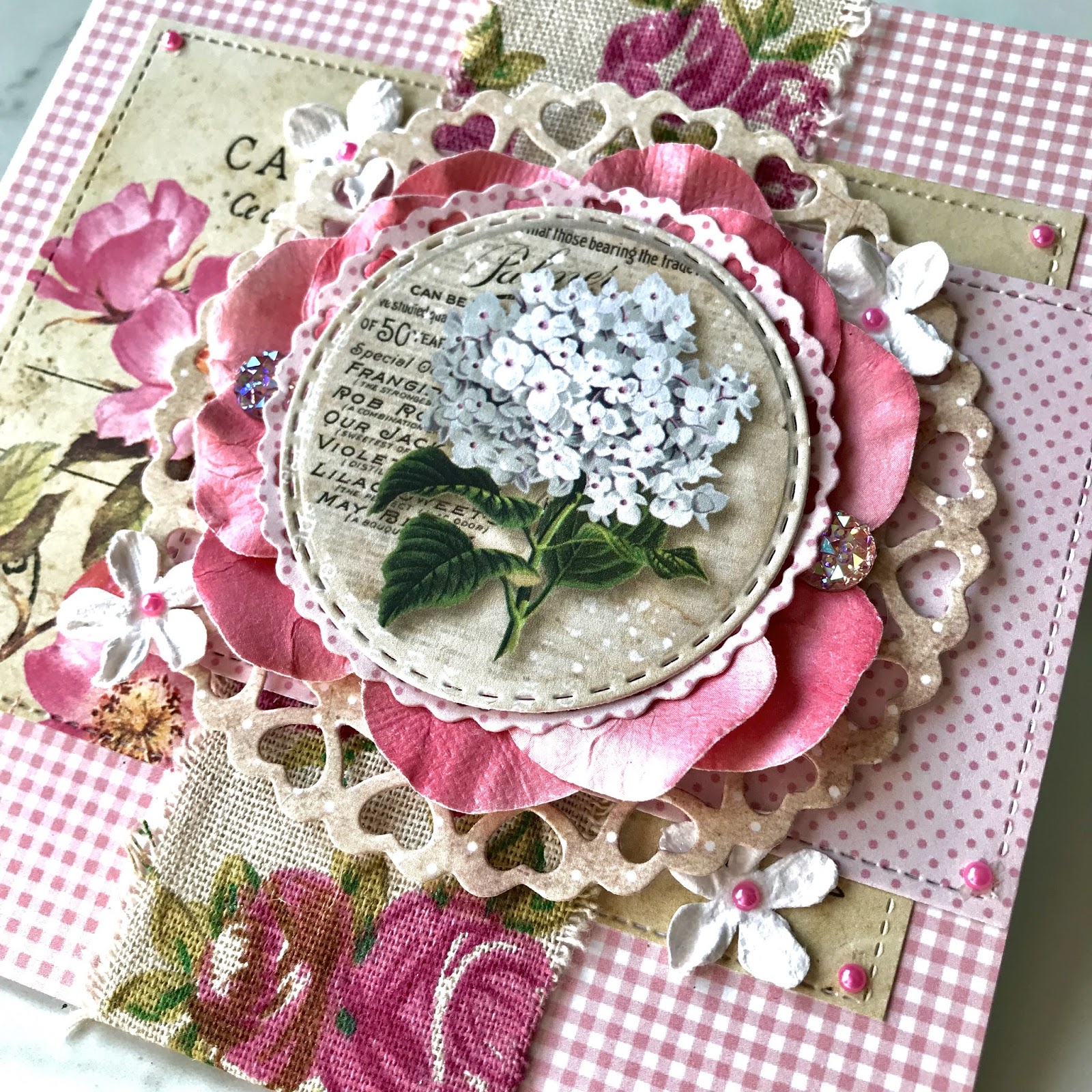
Using an image from the Vintage Time collection fussy cut page, I centered it as the focal point for my card. Since the card's theme is predominantly pink, I thought this white bouquet of gorgeous vincas would be the perfect contrast against the pink gingham background.

In addition to the contrasting white bouquet, layers were added underneath to make the focal point sort of pop up quite literally from the rest of the card. Remembering to keep the card simple, I limited the dimensional element only underneath the bouquet.

The lovely postcard you see in the background is from the ephemera pack which I have linked below. It is the second layer from the background paper to make it appear as if it was the postcard that was somewhat "wrapped" with the burlap floral ribbon, ready to be delivered.

Without adding too many patterns, I used similar patterned papaer to the gingham using dotted paper from the House of Roses paper pad to buffer the imagery between the layers. What this does is help hide some of the post card and ties the main ephemera piece to the background so that it all stays connected. I believe strongly in having my pieces all connect in design similarities so that there is harmony. This also helps the beige colored die cut heart circle stand out from the postcard with pink peeping through.

I used cute little white flowers that matched the bouquet and adhered tiny little pink pearls to make them match the vincas and decided to adorn the corners for consistency.

For dimension in most of my projects, I use foam tape, but I hate to rely solely on foam tape so I always make sure to use any elements that might help me get that extra "oomph" in my layering. In this case, I tore the petals off of a large paper flower (If you gasped, I understand completely, but sometimes you need to improvise!) and glued the petals around the die cut heart frame to match the florals in the background. Again, I did this to create that connection for consistency and to also make the pink centers of the vincas pop.

Lastly, I added two gemstones to counterbalance the vertical burlap strip. I love using these gems because it adds this beautiful light catching sparkle that rhinestones have. I always try to make my projects sparkly when I can!
Thank you SO much for checking out my blog post on this feminine vintage floral card! If you like my work please know that you can get these posts e-mailed to you by subscribing! Check out the links below if you are interested in creating with these gorgeous papers.


Gorgeous card
ReplyDeleteThank you Katie!
DeleteStunning card. Leanne x
ReplyDeleteThank you Leanne!
Delete