Showing posts with label card making. Show all posts

Friday, August 17, 2018

"Wrapped in Adventure" Layered Card for Cherish the Memory


Layers and Distressing 

Using Studio Light's Paper Collection"Memories of Summer"


Creating Layers

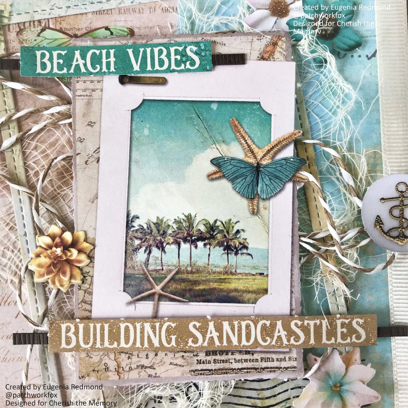
Do you ever have a hard time choosing background paper from a paper pad? I know I always end up spending more time trying to choose sometimes than I'd like to admit. Anyway, so what I have been doing is just combining different backgrounds from the same paper pad by simply layering them. In a previous project, using the same "Memories of Summer" collection, I die cut portions of the background paper and 3D foam taped it to the card. In this card, (pictured left) you can see that it is adhered all to the base.


In this card, I have used three layered backgrounds. What is different about these layers? I decided to play with the contrast of using a black base for the card, and rather than distressing the backgrounds and using 3D foam tape, I have individually adhered each layer to black card stock, to help visually separate and call attention to each layer. I like to use black when the background graphics are busy in nature to be able to "pop" behind each background and to emphasize dimension. After adhering each of the three backgrounds to card stock of contrasting color, use 3D foam tape to prop each layer up on top of one another to create a tangible experience for the recipient.


Sneaking in Details

This card measures 6x6 and is a perfect size to give you plenty of room when you want to add detail. I can never add enough detail, but I strongly believe that it is okay as long as you are adding detail with a purpose. Detail with a purpose is when you tuck away details in between layers to create a connection between them, but also a fantastic way of keeping the viewer's eye busy! This collection is perfect for that, as it features die cut pages of ephemera, small flowers and travel themed accessories. This lovely collection is available at Cherish the Memory and I have provided links below. I hope you've gotten some insight on how to use layers and create dimension! Please let me know if you have any questions in the comments.


Monday, July 23, 2018

Tropical Summer themed Card for Cherish the Memory


 An Inspirational "Getaway" card
using Studio Light "Memories of Summer" Paper Collection


An Alternative to Post Cards


Most people send postcards from exotic places they are visiting when it comes to a tangible card form, but the reality is most of us nowadays use social media to share pictures of family at the pool or if you are travelling solo, pictures of your toes in the sand. Personally, the only time I have ever sent a postcard to someone is when they requested one, but I felt like it lacked something. Sure, it's perfect when you want something fast and simple to buy, but what if you were a crafter and wanted to make something a little more memorable? 

Cherish the Memory sells these fantastic 3D pre-die cut ephemera pieces that literally require just your hands to punch out! Meaning, you have the choice of bringing a few pages with you for some tropical crafting fun or a quick crafty make for when you come home from vacation, need some crafty time and or don't feel like unpacking just yet. The links to what you need to make this card is listed below.


Layering for Photos

What I love most about these ephemera pages is that there's quite a variety of ephemera that resemble photographs, which you can easily use as a decorative item on your card or for an easy way to layer a real photo on top of, to create dimension. I particularly liked the "Building Sandcastles" sentiment, because it brought me back memories of my childhood where my mom bought my sister and I pails and shovels to use on the sand at the beach...perfect for when you have photos of some fun in the sand!


Last not but not least, the flowers. There is a generous assortment of die cut flowers to choose from and these were particularly lovely as they were of the tropical kind! A great way to add a tropical or feminine touch to any card depending on how many you choose to use. There is no limit!

I hope you have enjoyed my post. The links to these Studio Light papers are linked below!

Cherish the Memory Store


Thursday, July 19, 2018

Simple Travel Themed Masculine Card


Creating a simple yet eye pleasing Masculine Card using Studio Light Paper from Cherish the Memory


If you're anything like me, you're drawn to floral, feminine, colorful designs which can sometimes pose a challenge when making a card for a man, or for a female friend who isn't into "girly" designs as you are. The "Memories of Summer" collection that you can purchase at Cherish the Memory really takes the guesswork out of picking and choosing paper for your masculine card. What is so great about this collection is that it has a good balance in range, therefore really allowing you to make both masculine, gender neutral and feminine projects without having to buy several collections!


My favorite part of the collections by Studio Light are the paper pads, which I will be providing the link to below. I love the paper pads because it comes jam packed with backgrounds, but you see that you don't have to use the backgrounds just for backgrounds. If you look at the three rectangular paper pieces, they have been die cut from the paper backgrounds in the pad to create the layering effect where I used foam mounting tape.

What I love most about this card is the use of neutral warm earth tones. Stick with natural colors such as browns and tans to get down the color scheme for a masculine card. I knew as soon as I saw the lighthouse from the ephemera pack that I would be using it, it's so pretty! The vintage plane stamp was also a really cool feature in the ephemera pages which I will also link. 

Some tips that helped me put this card together :
1. Use earth tones such as browns, tans, grays, greens and blues
2. Take items from your stash that you have found yourself neglecting and throw things together to see if they complement the card. The background paper has a wooden grain texture which I had no plans for, until this card came up!
3. Jute adds a great natural element that is gender neutral. Texture in masculine cards is your friend.
4. Keep the design simple. I struggle with simple design but simple and clean is a must to achieve that perfect look. Masculine details can be pretty powerful, and you want them to speak for themselves and not overwhelm the card or viewer.
5. It helps to choose a 5x7 layout for a masculine card, the linear layout helps create a stronger card.

I hope you found some inspiration and ideas! Check out the Cherish the Memory shop for the collection:  


Friday, June 22, 2018

Adventures in Travel Card for Cherish the Memory

"Adventure" Mixed Media Card using "Memories of Summer" Studio Light Paper Collection


It's that time of year where everyone is happy that it's Summer because they are either going on vacation or they're simply happy that school it out! Whatever people choose to do, it's usually a given that most people relax and have fun. This card illustrates the wonder of travel by using Studio Light's "Memories of Summer" Collection available at Cherish the Memory store

Below are image links to the Studio Light products I have used to create this card :


How to make this card


As you can see, this collection is a pre-cut treasure trove of ephemera, which really makes cards using Studio Light paper really easy! I like to however, convert anything I can into mixed media so I used a combination of different styles of texture embellishments.


For the materials and embellishments I used :

Ranger Glossy Accents
Mini Prills by USArtQuest
Rhinestones
Faber Castell Glitter Glass 
Jute Twine
Cheesecloth
Nuvo Crystal Drops in Ebony
Prima Marketing Paper Flower
Recollections by Michael's Butterfly
Ranger Archival Ink in Tree Branch
BoBunny Text Stamp
Fiskars Corner Punch in Romantique
Prima Marketing Paper Distress Tool
Black Cardstock


Steps:

1. Create a 6x6 card using black cardstock. Take your paper of choice from the "Summer Memories" Paper pad, distress the edges and corner punch as desired and adhere.
2. Stamp the background using your favorite text stamp and your preferred ink color, making sure it matches the overall color theme of your card.
3. On the left side of the card or wherever your focus will be, use adhere down cheesecloth as the base of your embellishments and ephemera.
4. Adhere with a strong adhesive your chipboard and use it as a frame so as to guide your layering choices with the ephemera you are to use.
5. After adhering the major paper ephemera pieces, choose the locations of your bigger embellishments such as any paper flowers or butterflies.
6. Adhere twine or string of choice to create a tie between the ephemera and the background of  the card.
7. Adhere down your rhinestones. I like to use rhinestones in dark corners to add a pop of interest and brightness.
8. After you are content with the placement of everything you can add the wet embellishments that need to dry.
9. Let card dry and enjoy!


Thank you so much for visiting my blog! I hope you have enjoyed the mini tutorial!


Thursday, May 24, 2018

Lemoncraft Vintage Inspired Shaker Roses for Cherish the Memory

My 6x6 May Shaker Card for Cherish the Memory DT


 "Be you, bravely"

Thanks for visiting my blog! I just love the chat stickers from Tim Holtz, there is a perfect selection of quotes and inspirational messages that can be guaranteed to express whatever your heart desires on cards for that perfect sentiment. I think it suits this card perfectly, as butterflies are as they are, free and bravely themselves with no restraint, as they fly free! That's what makes them so beautiful.

These vintage inspired papers from Lemoncraft are just gorgeous to work with, I have created cards with these papers several times now and just do not tire of working with them! Links below to purchase, with the last link to a great listing for a deluxe kit!


A close up of the sentiment, I felt that it went perfectly with the framing of the shaker window frame, as a plaque to the centered image.


I used as assortment of matching sequins in pink and green along with iridescent translucent sequins. Tip: Add seed beads to your shaker cards so make sure there is plenty of movement and an extra noise effect.


To tie the elements of the shaker card and the butterflies, I used clear drying adhesive to attach clear seed beads to the centers of the butterflies. Butterflies look like they are fluttering on the card when you fold the middle! 

I hope you have enjoyed my post! 

Make sure to check out the lovely Lemoncraft collection available at Cherish the Memory below!


Wednesday, March 14, 2018

Vintage Pink Gingham Vinca Card

A 6x6 Dimensional Card using Lemoncraft's House of Roses Paper 

for Cherish the Memory


Hey there! Welcome to my blog post!


I love red and pink. I love both of them together, but out of the two if I had to choose one I would most certainly pick pink! A super bright fuchsia pink! I try to work in colors other than pink because it is one of the many ways I challenge myself as an artist. So, when I was sent this paper collection by Lemoncraft called House of Roses from Cherish the Memory, this girly girl was delighted! As usual I will post links at the end of my post on where to purchase.


So I went with simple design again with this card. Much like the last card, I wanted to keep it a neat and fast to make project. Coming up with the layout took me less than ten minutes and about half an hour to assemble! Oh! And while watching my soap opera! Talk about multitasking!


Using an image from the Vintage Time collection fussy cut page, I centered it as the focal point for my card. Since the card's theme is predominantly pink, I thought this white bouquet of gorgeous vincas would be the perfect contrast against the pink gingham background.


In addition to the contrasting white bouquet, layers were added underneath to make the focal point sort of pop up quite literally from the rest of the card. Remembering to keep the card simple, I limited the dimensional element only underneath the bouquet.


The lovely postcard you see in the background is from the ephemera pack which I have linked below. It is the second layer from the background paper to make it appear as if it was the postcard that was somewhat "wrapped" with the burlap floral ribbon, ready to be delivered.


Without adding too many patterns, I used similar patterned papaer to the gingham using dotted paper from the House of Roses paper pad to buffer the imagery between the layers. What this does is help hide some of the post card and ties the main ephemera piece to the background so that it all stays connected. I believe strongly in having my pieces all connect in design similarities so that there is harmony. This also helps the beige colored die cut heart circle stand out from the postcard with pink peeping through.


I used cute little white flowers that matched the bouquet and adhered tiny little pink pearls to make them match the vincas and decided to adorn the corners for consistency. 


For dimension in most of my projects, I use foam tape, but I hate to rely solely on foam tape so I always make sure to use any elements that might help me get that extra "oomph" in my layering. In this case, I tore the petals off of a large paper flower (If you gasped, I understand completely, but sometimes you need to improvise!) and glued the petals around the die cut heart frame to match the florals in the background. Again, I did this to create that connection for consistency and to also make the pink centers of the vincas pop. 


Lastly, I added two gemstones to counterbalance the vertical burlap strip. I love using these gems because it adds this beautiful light catching sparkle that rhinestones have. I always try to make my projects sparkly when I can!

Thank you SO much for checking out my blog post on this feminine vintage floral card! If you like my work please know that you can get these posts e-mailed to you by subscribing! Check out the links below if you are interested in creating with these gorgeous papers.


"Wrapped in Adventure" Layered Card for Cherish the Memory

Layers and Distressing  Using Studio Light's Paper Collection "Memories of Summer" Creating Layers Do you ever ...