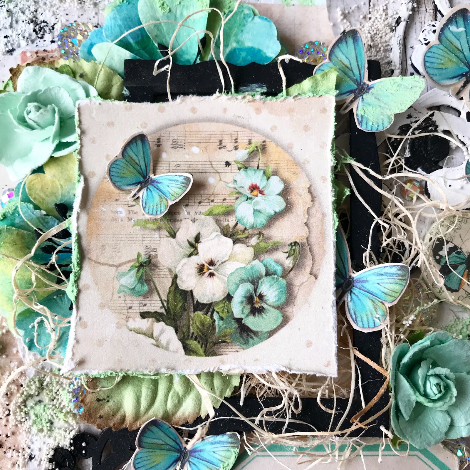
"Make today count" Mixed Media Tag
for Cherish the Memory
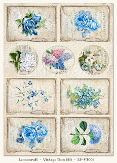
Using Lemoncraft's House of Roses Collection
"Make today count"
That is essentially everyone's goal, on a daily basis, right? Most of us may feel like we don't succeed in making every single day "count" but I think it's safe to say that most of us try. I like to think that every day counts, no matter what, even if we can't see how. I also think "make today count" means we should take some time every day to take a look around at the beauty in our surroundings, and I think this tag full of pretty flowers and butterflies is a great reminder to do that! This wonderful sentiment is a Tim Holtz sticker.
The House of Roses collection by Lemoncraft Papers is perfect for any lover of shabby chic! If you'd like to make this tag, the collection is available at
Cherish the Memory store. I will list the links to the items at the end of my blog post.
The collection has a beautiful vintage theme, which is made up of soft shades of pink, creams, browns and greens. To showcase the softness of these colors, I decided to use black elements for contrast. To make these classic vintage colors pop, I added a cute black chipboard window frame by Creative Embellishments and used a black tag. If you don't have a black tag on hand, you can always use black cardstock paper to glue onto the tag, and make your tag thicker for more durability.
To tie the design of this retro polka dot pink background, I used a Fiskars punch called "Romantique" to make the edges match the style and soften the edges. Consider checking this punch out, it has three different edges and they are all gorgeous. I use it frequently!
How I gave the tag texture
Background Elements
Do you see that lovely flair button? I am new to working with flair buttons and I LOVE them. They give such a new to me dimension and enhances the layers!
To give the flowers an organic effect, I like to add materials that look like fine straw and twine. I find that using these materials helps to "fluffen" up the texture and give great dimension! Adding natural elements to any floral project really adds a realistic factor without having to go dig up anything in your garden! I personally don't have a garden, but I do own some English rose shrubs that may or may not have been such a great idea to grow here in Texas, since I can't stand to be outside most of the year. Oops.
Texture Materials :
Ranger Glossy Accents
Nuvo Drops
Finnabair art ingredients Mini Art Stones
Faber Castell Glass Bead Glitter Gel
Pink Glitter
Clear Gesso/Clear Gel Medium
Texture Instructions
For this tag, I wanted to create subtle texture that would connect all the elements in the tag, but not become heavy or distracting. The background is very easy to create, just apply a coat of clear gesso or clear gel medium to the background paper and allow to dry first. Take a palette knife or a spatula, then, spread the Faber Castell Bead Glitter Gel on a craft/glass mat and mix by sprinkling glitter and Mini Art stones at your own preference and apply to the desired areas.
Tip : Use Ranger Glossy Accents to create dew drops on flowers
I hope you have enjoyed my post! Thank you so much for stopping by. I have linked the paper I used below.